Few logos in esports carry the weight, recognition, and passionate fanbase that OpTic Gaming’s green insignia commands. Since 2006, the OpTic brand has evolved from a scrappy Call of Duty sniping team into one of the most influential organizations in competitive gaming history. But it’s not just wins and championships that built this legacy, it’s the visual identity that’s been plastered across jerseys, streaming overlays, and millions of pieces of merchandise worldwide.
The OpTic Gaming logo isn’t just a graphic. It’s a rallying symbol for the Green Wall, the devoted community that’s followed the org through ownership changes, rebrands, and countless roster shake-ups. Whether you’re a longtime fan trying to trace the logo’s evolution, a designer curious about what makes esports branding work, or someone wondering who owns OpTic Gaming these days (spoiler: it’s changed hands more than a few times), this deep dive covers everything you need to know about one of gaming’s most iconic marks.
Key Takeaways
- The OpTic Gaming logo evolved from a simple DIY design in 2006 to an iconic symbol recognized across esports through decades of consistent branding and community investment.
- OpTic’s signature green and white color palette strategically differentiates the brand in a competitive esports landscape, while the aggressive typography reflects the organization’s FPS gaming roots.
- The ‘Green Wall’ community identity demonstrates how authentic visual branding, when paired with genuine fan engagement, creates cultural significance that transcends competitive results.
- Proper logo usage requires respecting OpTic’s trademark protections, with fan content tolerated in non-commercial spaces but commercial applications requiring explicit permission.
- OpTic’s branding strategy—investing early in visual identity, designing for multiple applications, and maintaining consistency across touchpoints—established industry standards that modern esports organizations continue to follow today.
The Origins of the OpTic Gaming Logo
OpTic Gaming was founded in 2006 by a group of Call of Duty enthusiasts who wanted to showcase sniping montages on YouTube. Back then, esports orgs weren’t the multi-million dollar operations they are today. Teams needed a visual identity that could stand out in thumbnail wars and forum signatures.
The earliest OpTic branding was rough around the edges, simple text treatments and basic graphics that reflected the DIY spirit of early gaming content creation. But even in those primitive designs, the seeds of what would become a branding powerhouse were planted: bold typography, aggressive angles, and a focus on memorability over complexity.
From Humble Beginnings to Iconic Status
What separated OpTic from countless other gaming clans wasn’t just skill, it was the understanding that branding mattered. As OpTic’s YouTube presence exploded (we’re talking millions of views when that actually meant something), the logo became shorthand for quality content and competitive excellence.
By 2008-2009, OpTic had established itself as a household name in the Call of Duty community. The logo appeared in video intros, stream overlays, and eventually on official team jerseys as competitive Call of Duty formalized into what we now know as the CDL ecosystem. That early investment in visual identity paid massive dividends as esports professionalized and merchandise became a revenue pillar.
The Evolution of the OpTic Gaming Logo Design
Like any long-running brand, OpTic’s visual identity hasn’t remained static. The logo has morphed through distinct eras, each reflecting the organization’s growth, ownership structure, and strategic direction.
The Original OpTic Logo (2006-2010)
The earliest OpTic logos were utilitarian, bold text with minimal ornamentation. These designs prioritized legibility at small sizes (crucial for YouTube thumbnails and forum avatars) and aggressive styling that telegraphed competitive intent.
Color schemes varied during this experimental phase. While green would eventually become synonymous with OpTic, early designs incorporated blacks, whites, and occasionally reds. The typography leaned heavily on angular, military-inspired fonts that were popular in FPS branding at the time.
These weren’t polished, agency-designed marks. They were created by team members with Photoshop skills and a vision, which actually gave them authentic edge that more corporate designs often lack.
The Modern Green Wall Era (2010-2017)
The Green Wall era solidified OpTic’s visual identity around the iconic green and white color palette that fans still associate with the brand. This period saw the introduction of the stylized “O” mark and more sophisticated logo treatments that worked across multiple applications.
As OpTic expanded beyond Call of Duty into games like Halo, Gears of War, and eventually CS:GO, the logo needed to work in different contexts. The design became more versatile, simplified shapes that scaled well, cleaner typography, and a focus on the “OpTic” wordmark paired with geometric symbol variations.
This was OpTic’s golden age of branding. The logo appeared on championship stages, Esports coverage platforms regularly featured the green insignia, and merchandise sales went through the roof. The Green Wall wasn’t just a fanbase, it was a cultural movement, and the logo was its flag.
The Infinite Esports Rebrand (2017-2019)
When Infinite Esports & Entertainment acquired OpTic Gaming in 2017, things got complicated. Corporate ownership brought resources but also corporate thinking about branding. The logo underwent refinements that, while technically more polished, felt less authentic to longtime fans.
The Infinite era introduced cleaner, more “professional” variations, smoothed edges, refined geometry, and applications designed for broadcast and sponsorship integration. But something was lost in translation. The rawness that made OpTic’s branding resonate with grassroots gaming communities got sanded down in favor of boardroom palatability.
This period also saw OpTic expand into the Overwatch League with the Houston Outlaws, which had its own distinct branding. The parent OpTic logo became one mark among many in a portfolio approach that diluted the core identity.
The Return to Roots: NRG and Beyond (2019-Present)
After Infinite Esports imploded in 2019, OpTic Gaming was acquired by NRG Esports (backed by investors including Shaquille O’Neal and Jennifer Lopez). This marked a return to the brand’s roots, both in management philosophy and visual identity.
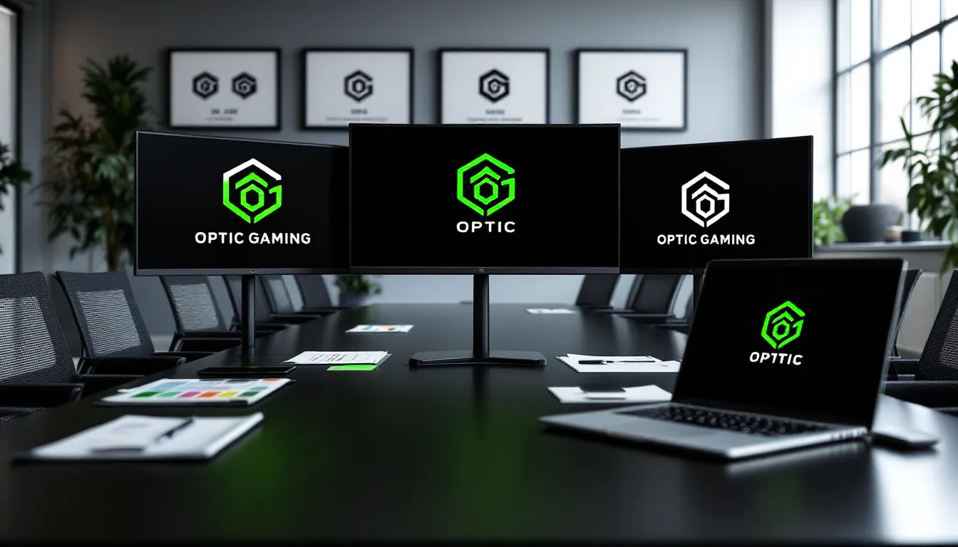
The current OpTic logo pays homage to the Green Wall era while incorporating modern design sensibilities. It’s cleaner than the 2010s versions but retains the aggressive energy and instantly recognizable green palette. The mark works equally well on Twitch overlays, competitive jerseys, and merchandise.
Under NRG’s ownership (who technically owns OpTic Gaming now), the brand has stabilized while maintaining the authentic connection with fans that made it special. The logo reflects that balance, heritage meets evolution.
Design Elements and Brand Identity
What makes the OpTic Gaming logo work isn’t accidental. Every successful esports brand identity combines color psychology, typography, and symbolism into a cohesive package that resonates with its target audience.
The Signature Green and White Color Palette
The OpTic green isn’t just a color choice, it’s a strategic differentiation. In a sea of red, black, and blue esports brands, that specific shade of green (roughly #00FF00 in hex, though official brand guidelines use a slightly more sophisticated variant) cuts through visual noise.
Green carries psychological associations with growth, energy, and ambition. In gaming contexts, it often reads as aggressive and competitive without the hostility that pure red can convey. The high-contrast pairing with white ensures readability across backgrounds and applications.
The Green Wall nickname emerged organically from this color choice, creating a virtuous cycle where branding reinforced community identity and vice versa. You can’t put a price on that kind of brand-community synthesis.
Typography and Visual Symbolism
OpTic’s typography has consistently favored bold, sans-serif fonts with aggressive angles and sharp terminals. This isn’t subtle corporate branding, it’s designed to telegraph competitive intensity and youthful energy.
The stylized “O” mark that’s appeared in various logo iterations draws from military and tactical aesthetics, nodding to OpTic’s FPS roots. Sharp angles, negative space treatments, and geometric precision give the mark a technical, almost weaponized feel that resonates with shooter game fans.
Modern variations have refined these elements without neutering them. The current logo maintains aggressive styling while working across digital and physical applications, a harder balance than it sounds.
Why the OpTic Gaming Logo Became So Iconic
Plenty of esports orgs have slick logos. Few achieve iconic status. OpTic’s mark transcended typical brand recognition to become a cultural symbol. Understanding why requires looking beyond design principles to community dynamics and cultural timing.
Community Connection and the Green Wall
The Green Wall isn’t a marketing construct, it’s an organic fanbase that grew alongside OpTic’s competitive success and content empire. The logo became the visual shorthand for membership in that community.
When fans wore OpTic merch or used the logo as profile pictures, they weren’t just supporting a team. They were declaring allegiance to a movement that represented a specific approach to gaming: competitive excellence mixed with personality-driven content and authentic community engagement.
This emotional connection meant the logo carried weight beyond aesthetics. It represented shared experiences, championship runs, roster drama, legendary content moments. That narrative depth transforms a graphic into an icon.
Merchandise and Cultural Impact
OpTic’s merchandise strategy turned the logo into a streetwear staple. Long before esports fashion became mainstream, OpTic hoodies and hats were visible in gaming spaces and beyond. The brand understood that fans wanted to represent their team in everyday contexts, not just during tournaments.
The logo’s versatility paid dividends here. It worked as a large back print, small chest embroidery, or subtle hat decoration. That adaptability, combined with the bold green colorway, made OpTic merch instantly recognizable.
Many competitive gaming communities have analyzed how OpTic’s branding approach influenced subsequent esports orgs. The lesson was clear: authentic visual identity paired with community investment creates brand value that transcends competitive results.
How to Use the OpTic Gaming Logo
If you’re creating content, building tribute projects, or just wondering about the boundaries of fan usage, understanding trademark and copyright considerations matters. OpTic’s brand is protected intellectual property, but fan usage exists in a practical gray area.
Official Usage Guidelines and Permissions
OpTic Gaming, like most professional esports organizations, maintains trademark protection on their logo, name, and associated branding. Official usage requires licensing agreements, if you’re creating commercial products, running events using OpTic branding, or otherwise profiting from the mark, you need permission.
For media coverage, news reporting, and editorial usage, standard fair use principles generally apply. If you’re writing about OpTic, reviewing their matches, or discussing esports history, using the logo for illustration falls under protected use.
Commercial applications are where things get dicey. Selling unofficial OpTic merch, using the logo in sponsored content without approval, or implying official affiliation when none exists crosses legal lines that can result in cease-and-desist letters or worse.
Creating Fan Content and Avoiding Copyright Issues
Fan art, tribute videos, and community content exist in a tolerated space. Most esports orgs, including OpTic, recognize that fan-created content builds community value and typically don’t pursue legal action against non-commercial fan usage.
Best practices for fan content:
- Don’t sell it: Keep it free and clearly mark it as unofficial fan work.
- Credit properly: Acknowledge that OpTic Gaming owns the trademarks and you’re creating fan content.
- Don’t imply endorsement: Never suggest your content is official or approved by OpTic unless it actually is.
- Respect takedown requests: If OpTic or their representatives ask you to remove something, comply immediately.
Many pro player communities have dealt with similar branding questions around team logos in guides and content. The general consensus: respectful fan usage that doesn’t compete with official merchandise typically flies under the radar.
OpTic Gaming Logo Variations and Formats
Professional brands maintain multiple logo variations for different applications. OpTic’s brand system includes several standard formats that serve different use cases.
The primary logo combines the OpTic wordmark with the iconic symbol, this is the full-power version used on jerseys, major marketing materials, and official communications. It requires sufficient space and works best at larger sizes.
The icon mark strips away text to leave just the stylized symbol. This works for profile pictures, app icons, watermarks, and situations where space is limited or the OpTic name is already established through context.
Wordmark-only versions provide flexibility for horizontal applications like website headers, lower-thirds in broadcasts, and sponsor integration where the symbol might compete with other visual elements.
Color variations include:
- Full color: The signature green and white on transparent or appropriate backgrounds
- Monochrome: Single-color versions (usually white or black) for applications where the green colorway doesn’t work
- Reversed: White logo on dark backgrounds versus dark logo on light backgrounds
File format matters too. Professional applications require vector files (AI, EPS, SVG) that scale infinitely without quality loss. Raster formats (PNG, JPG) work for digital applications but require appropriate resolution, at minimum 300 DPI for print, though screen use can work at 72-150 DPI depending on size.
Official high-resolution versions should only be sourced from OpTic’s official channels or licensed partners. Third-party recreations often have subtle differences that mark them as unofficial.
Where to Find High-Quality OpTic Gaming Logos
If you need the OpTic Gaming logo for legitimate purposes, sourcing official, high-quality versions matters. Low-resolution images scraped from random websites look unprofessional and may include unauthorized modifications.
Official OpTic Gaming channels are the primary source. Their website, official social media accounts (particularly Twitter/X and Instagram), and press kits occasionally provide brand assets for media and partner usage. If you’re doing legitimate coverage or partnership work, reaching out to their media team can yield official files.
Brand Guidelines and Press Kits exist for media members and partners. Professional esports orgs maintain these resources to ensure consistent brand representation. Access typically requires media credentials or partnership status, but it’s the gold standard for official assets.
Wikimedia Commons and esports databases sometimes host logo files uploaded for reference purposes. Quality varies wildly, and these sources often lack proper licensing documentation. Use with caution and verify quality before deploying in professional contexts.
Vector recreation sites like Brands of the World or similar repositories sometimes feature community-recreated versions. These are technically unauthorized reproductions, though often high-quality. They exist in a legal gray area, fine for personal projects, questionable for commercial use.
Never use:
- Low-resolution screenshots from streams or videos
- Stretched or distorted versions that alter aspect ratios
- Modified versions with changed colors or added elements
- Files with visible compression artifacts or pixelation
- Watermarked versions with the watermark cropped out
If you can’t source legitimate high-quality files and your usage is important enough, contact OpTic Gaming directly. Professional orgs typically accommodate legitimate usage requests from media, educational institutions, and appropriate partners.
The OpTic Logo’s Influence on Esports Branding
OpTic Gaming’s branding success didn’t happen in a vacuum, it influenced how an entire industry approached visual identity. The ripple effects are visible across modern esports design.
Before OpTic proved the model, many esports orgs treated logos as afterthoughts. Teams would commission generic designs from freelancers with no understanding of gaming culture or merchandising requirements. OpTic demonstrated that investing in strong, consistent branding created tangible business value through merchandise sales, sponsorship appeal, and community loyalty.
The Green Wall phenomenon showed that color could become community identity. Following OpTic’s success, orgs became more strategic about color selection and consistency. Teams started thinking about how their visual identity would photograph in crowds, trend on social media, and translate to merchandise.
OpTic’s integration of branding across content, competition, and commerce created a blueprint that modern orgs still follow. The logo wasn’t just slapped on jerseys, it was woven into video intros, social media presence, player personal brands, and every fan touchpoint. This holistic approach to brand deployment became industry standard.
Lessons for Aspiring Esports Teams and Creators
If you’re building an esports brand or gaming content operation, OpTic’s trajectory offers specific lessons:
Invest early in visual identity. Your logo will appear in thousands of contexts over your brand’s lifetime. Getting it right from the start (or being willing to evolve it thoughtfully) pays compound returns.
Color is strategy, not decoration. Choose distinctive colorways that differentiate from competitors and photograph well. Test how your colors look in crowds, on stream overlays, and on merchandise before committing.
Design for applications, not just aesthetics. Your logo needs to work at profile picture size and billboard scale, on light backgrounds and dark, in motion graphics and embroidery. Versatility isn’t optional.
Community identity amplifies brand value. The Green Wall didn’t happen because of the logo, the logo became iconic because the community rallied around it. Build authentic fan connections and your visual identity becomes shorthand for that relationship.
Consistency compounds. OpTic’s decades-long commitment to green and white (even through ownership changes and rebrands) created cumulative recognition value. Don’t chase trends at the expense of brand equity.
Respect your heritage. When OpTic returned to roots after the Infinite era, fans celebrated because the brand acknowledged what made it special. If you build something meaningful, honor that foundation even as you evolve.
Modern esports branding is more sophisticated than the 2006 era when OpTic started, but the fundamental principles remain: distinctive visual identity, authentic community connection, and consistent execution across touchpoints. The OpTic Gaming logo became iconic because it represented something real to millions of fans. That’s the standard every esports brand chases.
Conclusion
The OpTic Gaming logo is more than green pixels arranged in a specific pattern. It’s a two-decade story of competitive excellence, community building, and branding savvy that transformed a Call of Duty sniping clan into an esports institution. From rough early designs to the polished mark representing NRG’s OpTic today, the visual identity has evolved while maintaining the core elements that made it resonate.
Whether you’re researching esports branding history, working on fan content, or just curious about the Green Wall phenomenon, understanding the OpTic logo means understanding a crucial chapter in competitive gaming’s professionalization. The mark has appeared on championship stages across multiple titles, fronted a merchandise empire, and given millions of fans a symbol to rally behind.
As esports continues maturing into a mainstream entertainment category, the OpTic Gaming logo stands as proof that authentic branding, rooted in community, consistent in execution, and distinctive in design, creates value that transcends any single roster, game title, or ownership structure. That’s the kind of brand equity you can’t buy, only earn through years of showing up for your community and competing at the highest level.